
A JOURNEY THROUGH MY CREATIVE PROCESS
“You don’t make mistakes, just happy little accidents.”
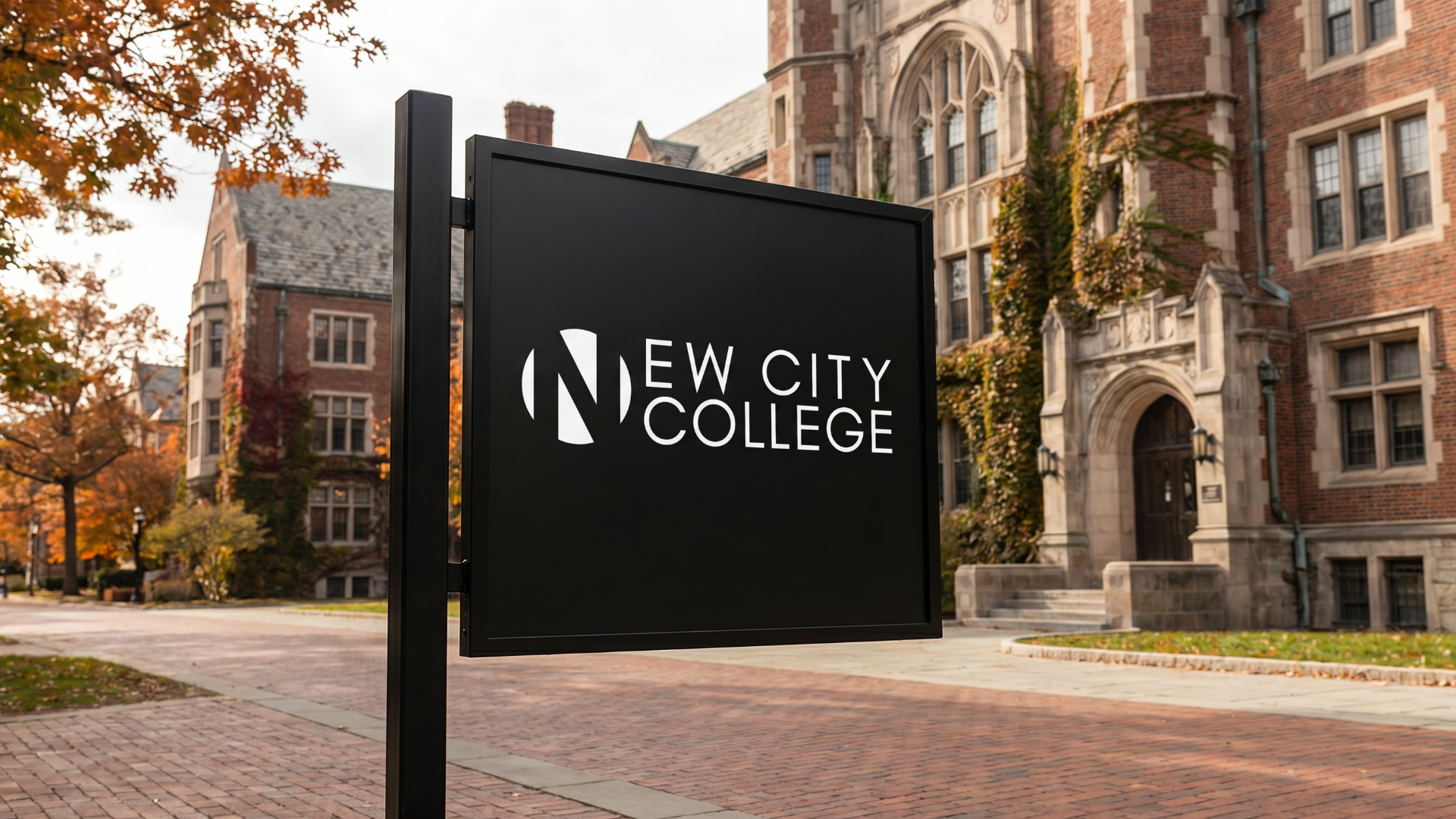
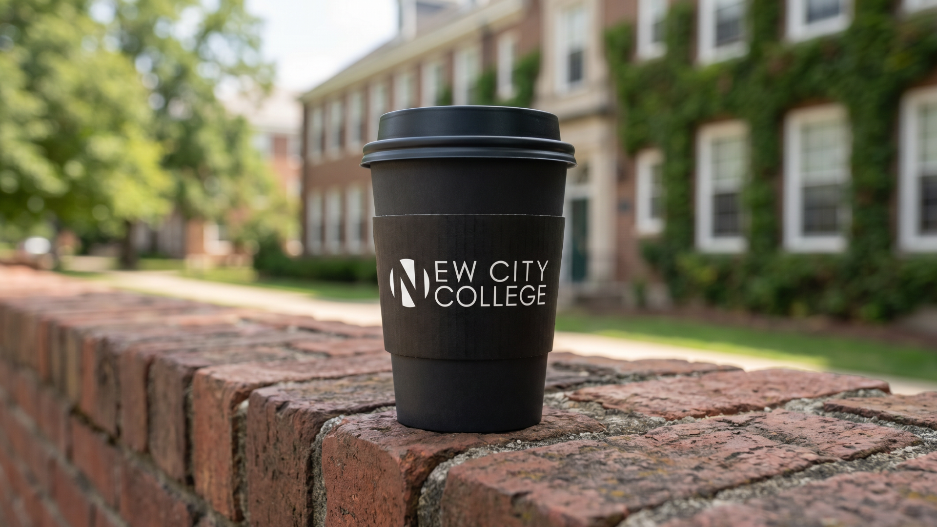
My goal starting with the first 5 campuses was to utilise a clean, readable typeface alongside a distinct colour coded system to identify each individual campus. This approach ensures a unified visual language that remains functional yet customisable without requiring modifications to the logo itself.
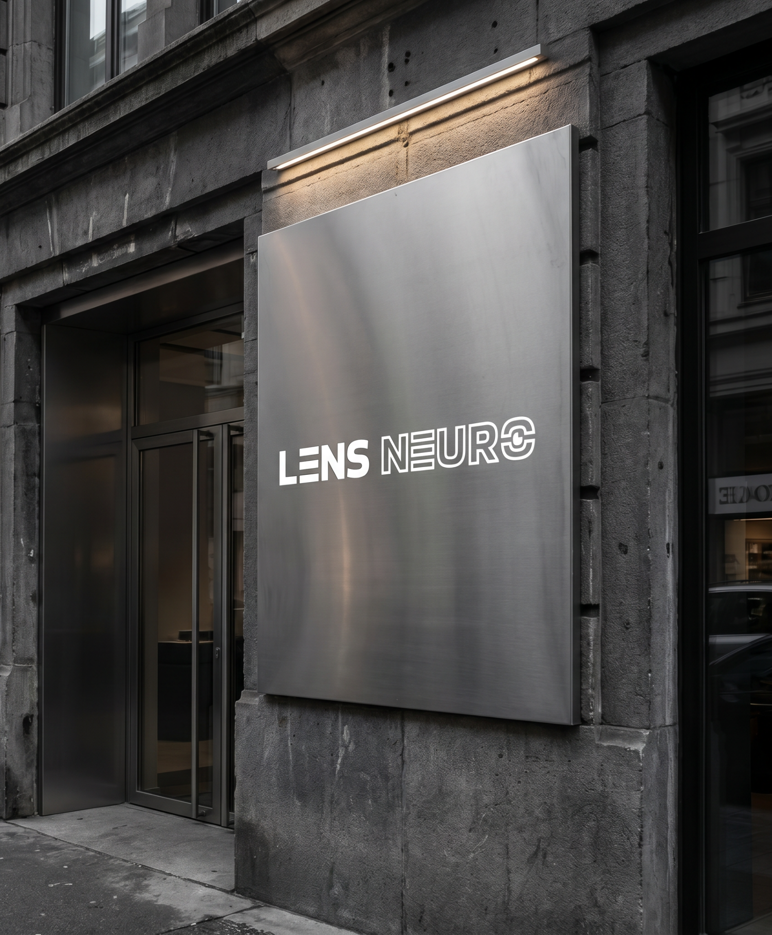
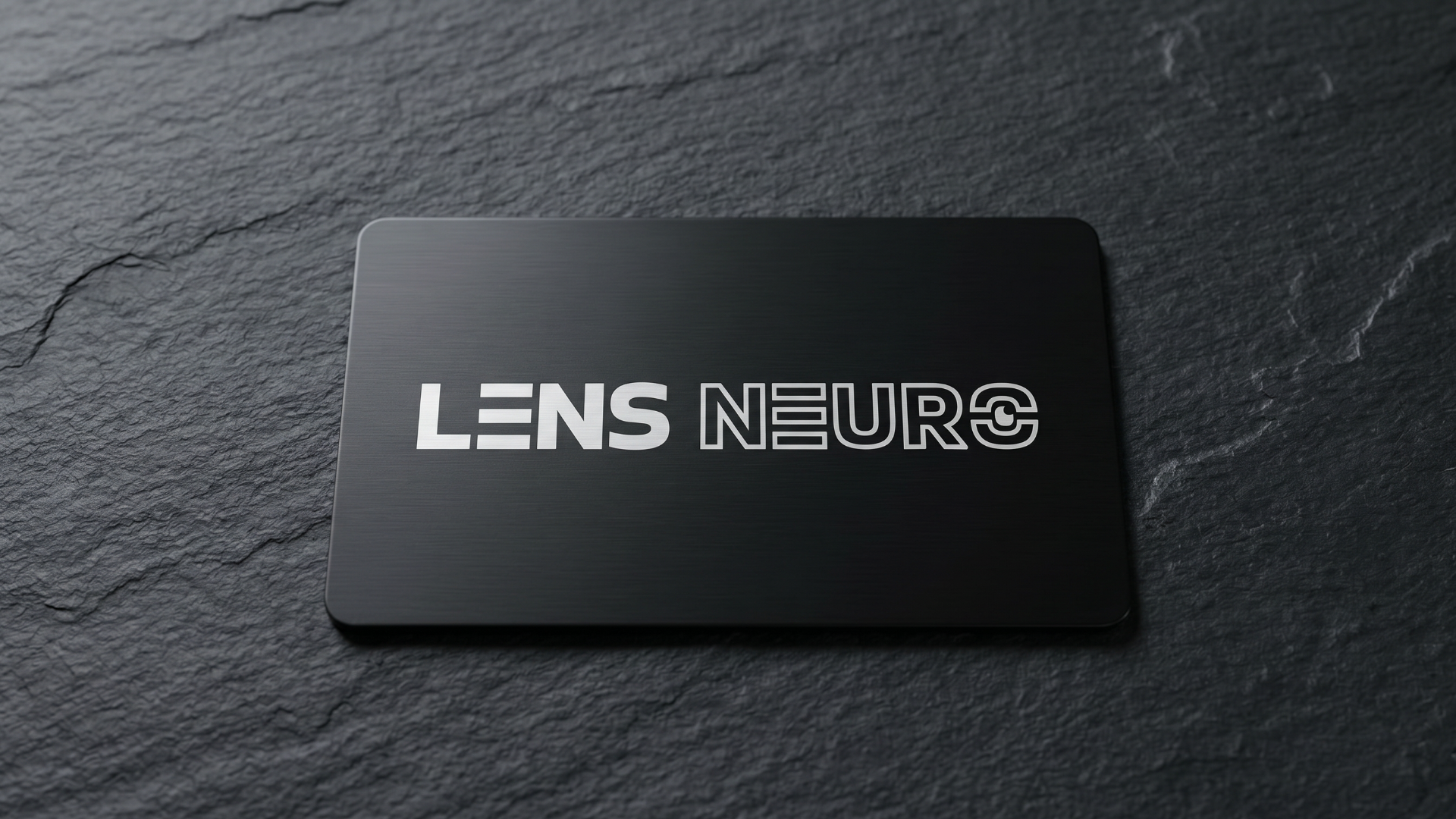
The goal for Lens Neuro was to create a high end visual system that works as a blueprint for neurodivergent minds. This design uses clear typography and a bold colour palette to help with immersive storytelling and cultural events. This approach creates a flexible identity that stays the same across digital spaces and luxury retreats whilst celebrating the full spectrum of diverse creative talent.
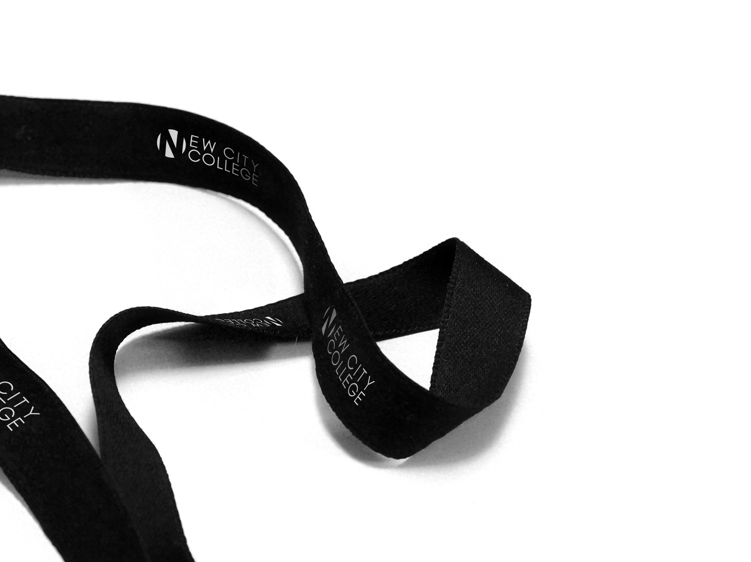
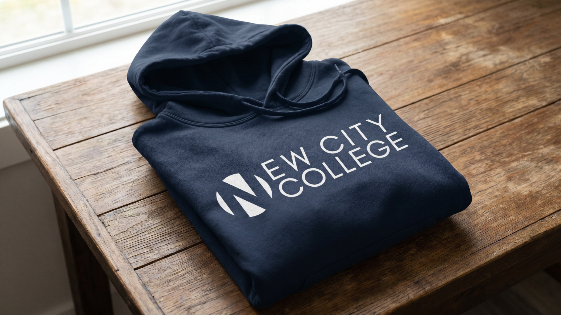
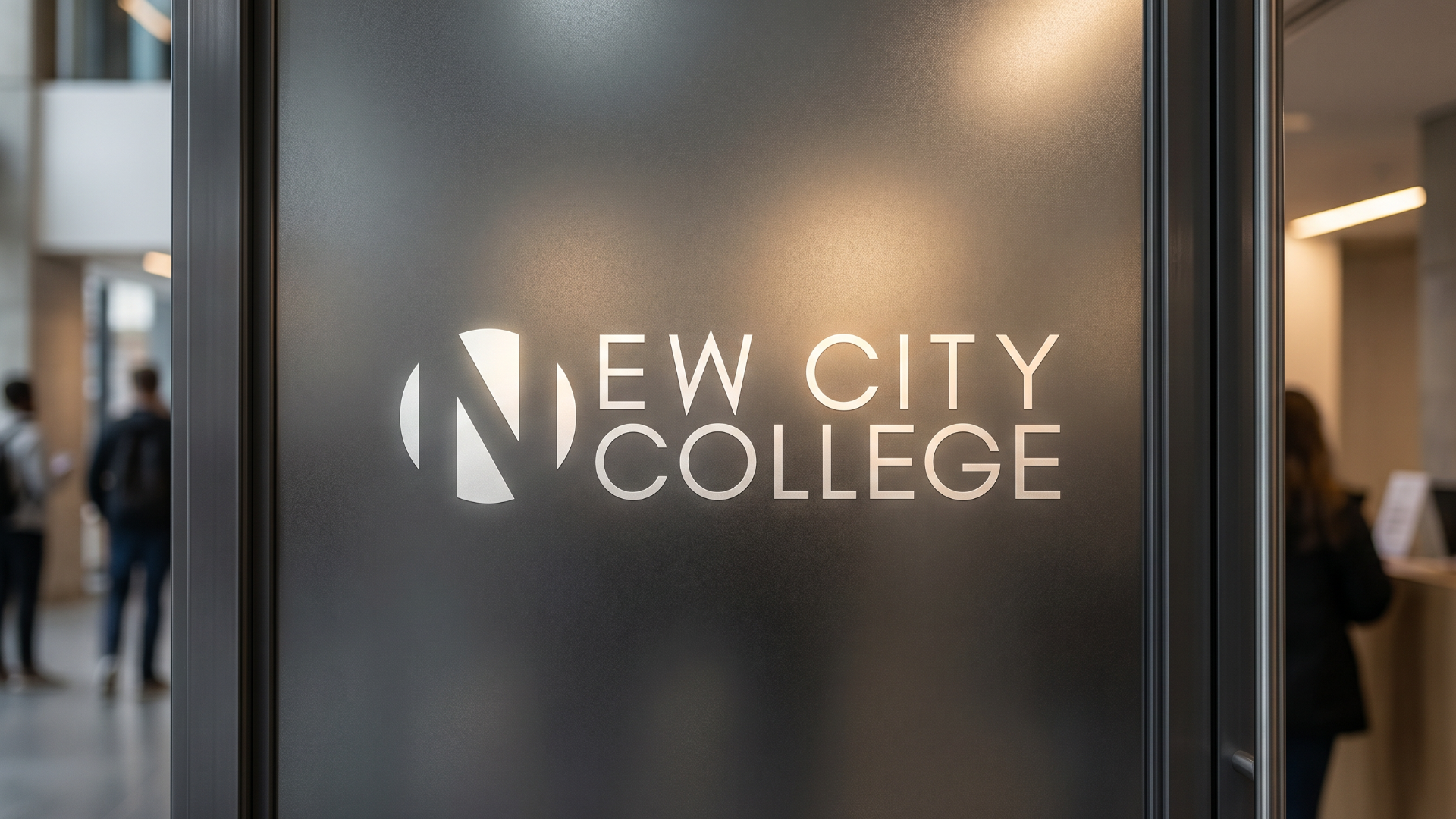
BRAND GUIDELINES
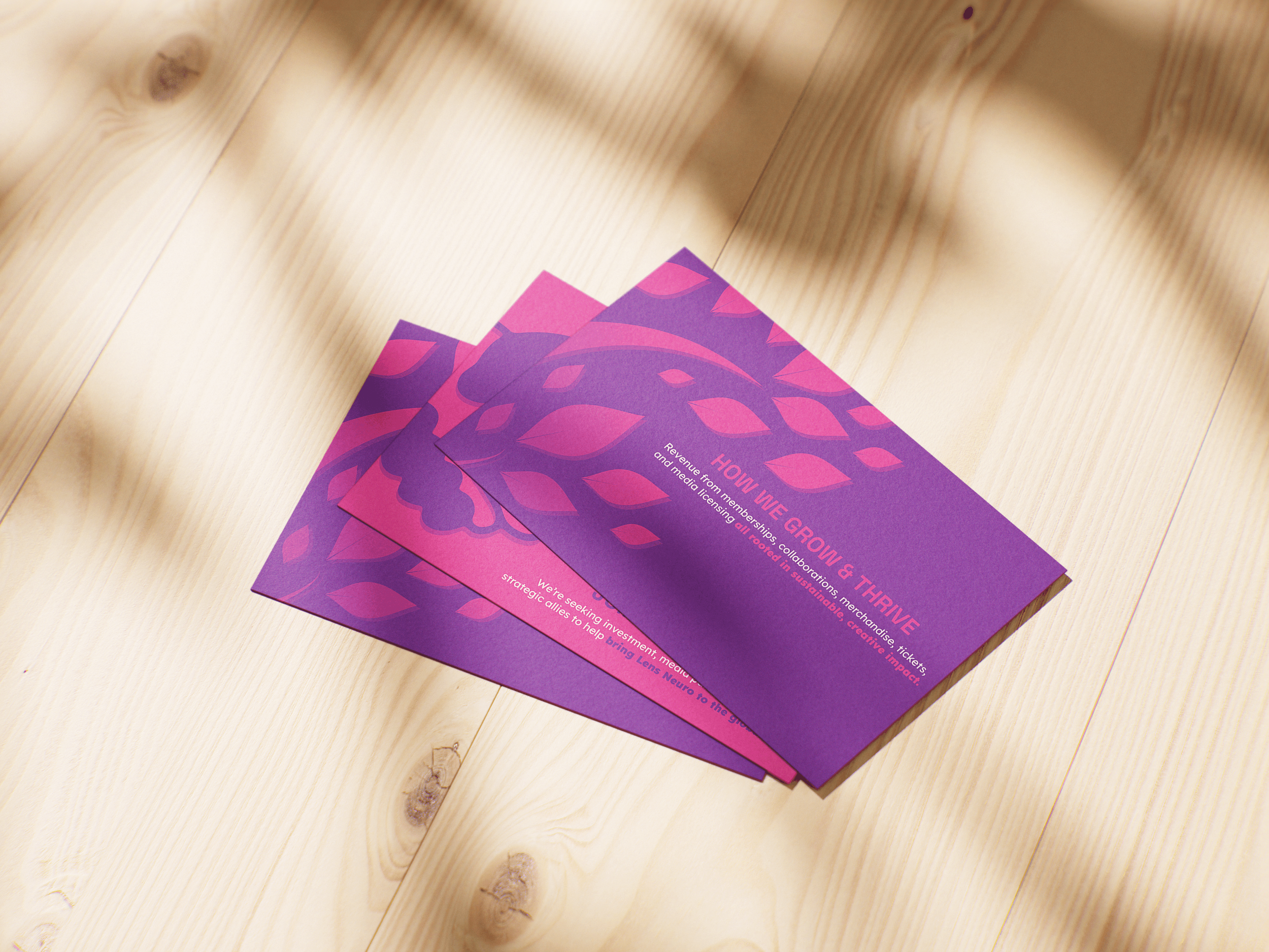
PITCH CARDS
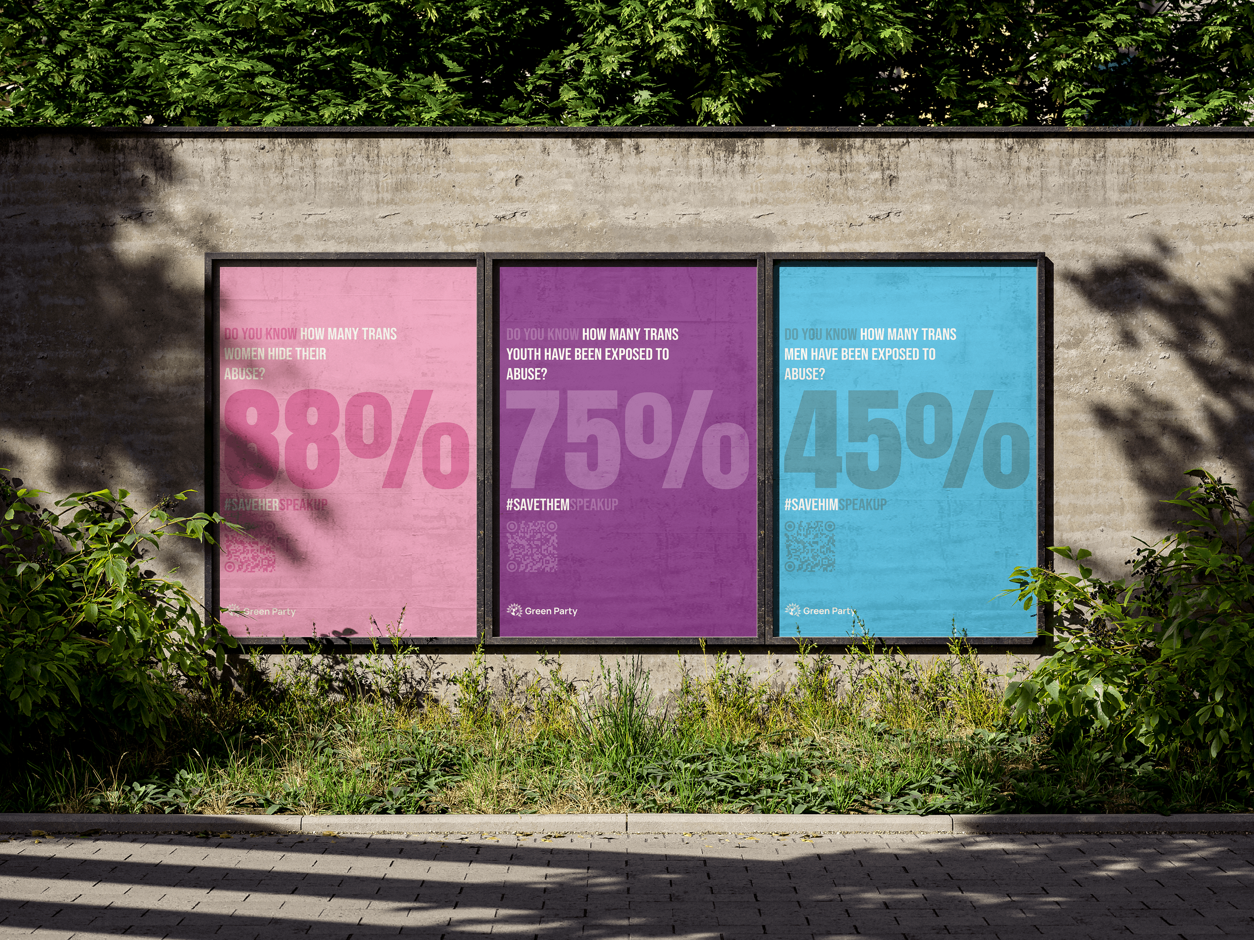
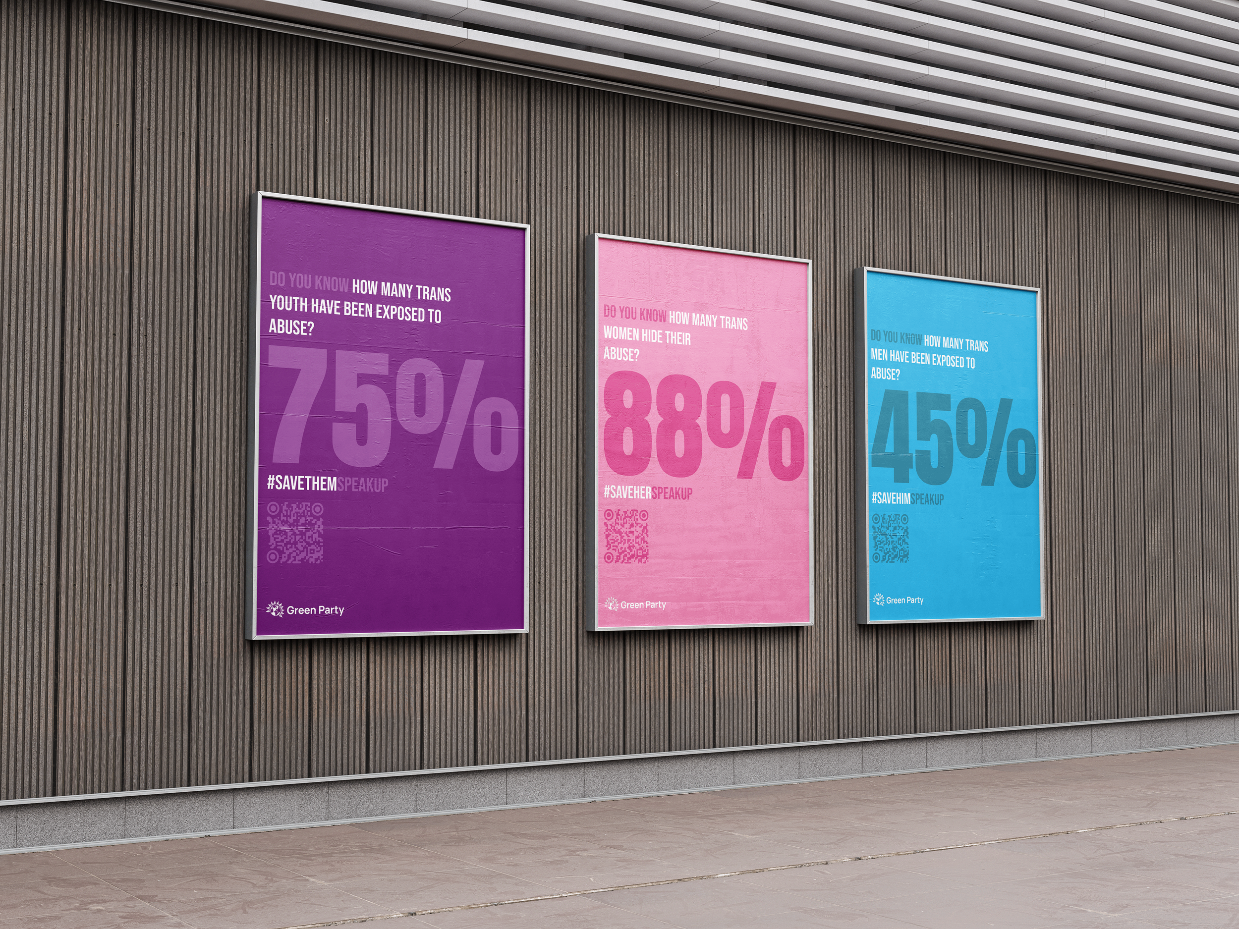
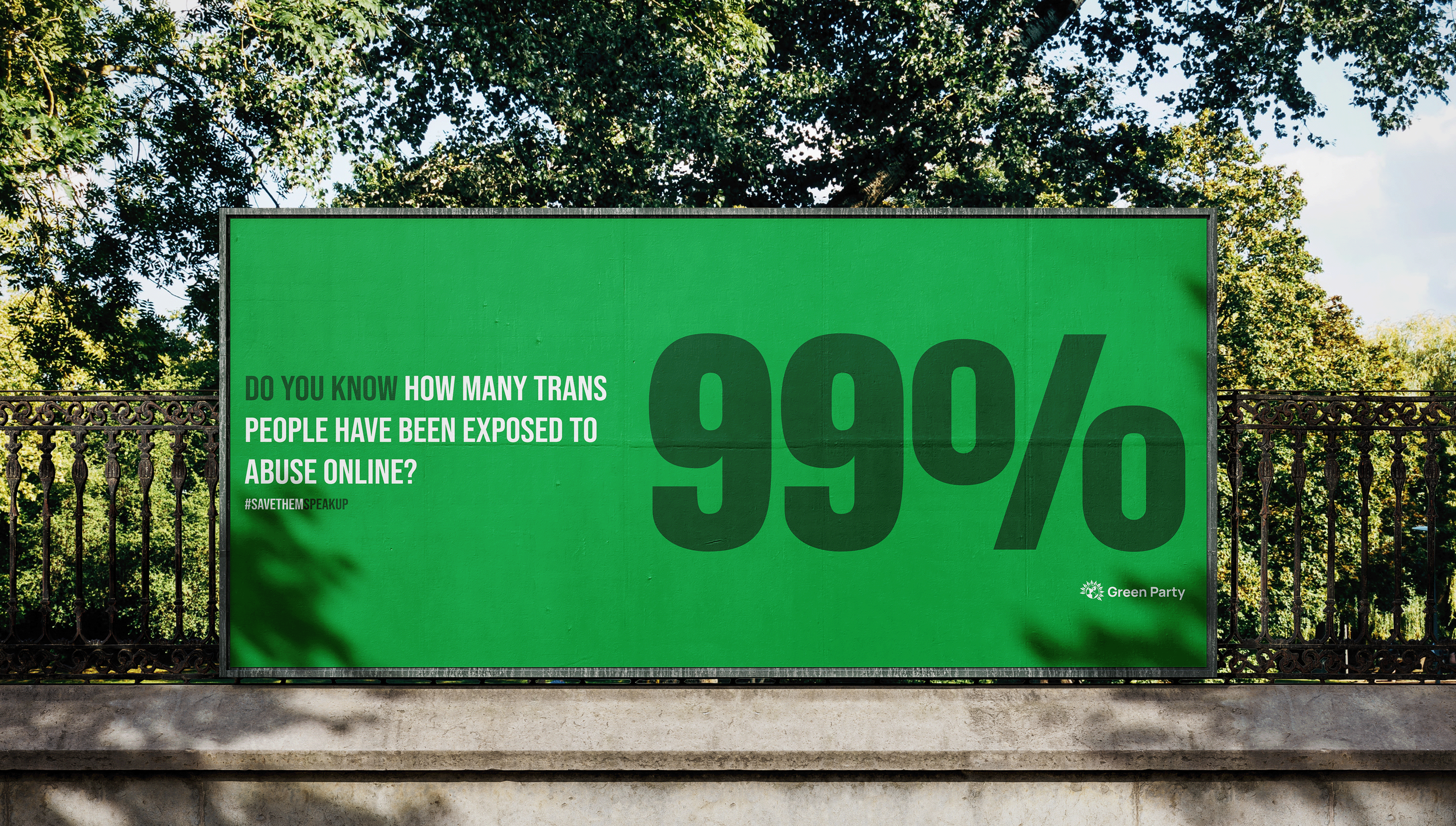
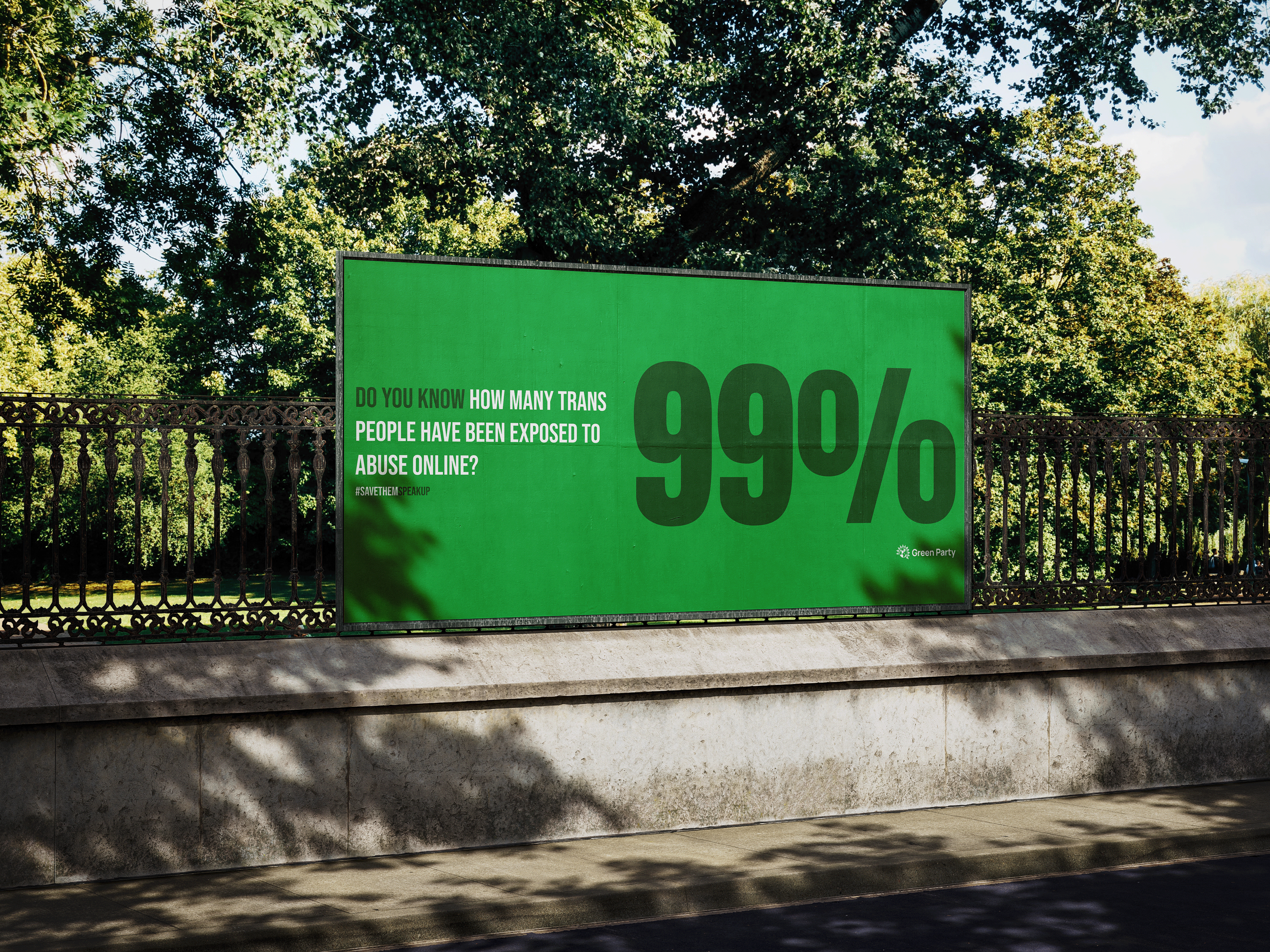
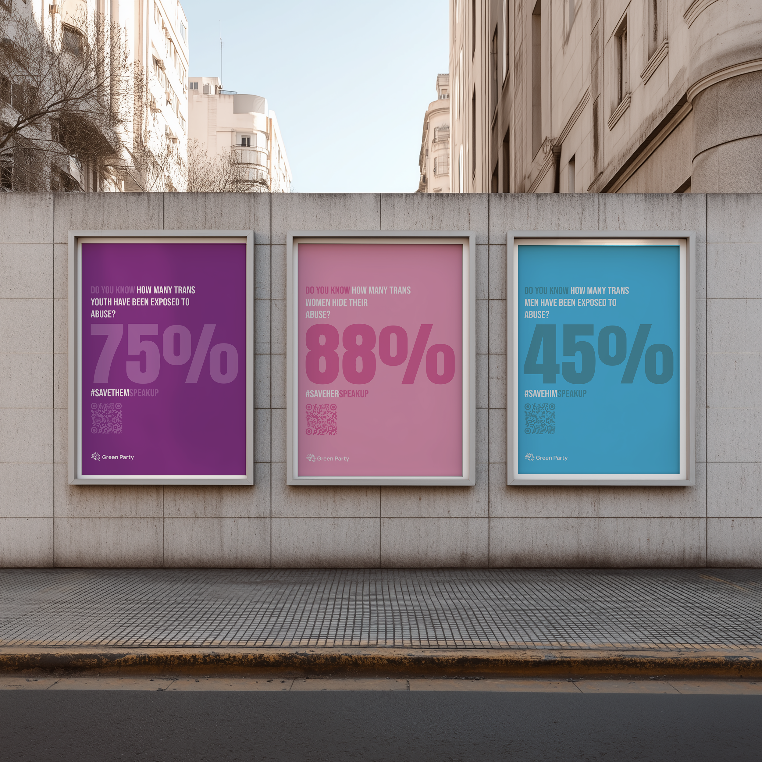
TRANS RIGHTS CAMPAIGN
My objective was to develop a bold, typography led visual system that utilised a factual colour coded language to highlight urgent statistics. This approach ensures the campaign remains clear and striking across both print and digital formats, allowing for an empathetic message that is rooted in research rather than subjective imagery.
Poster campaign
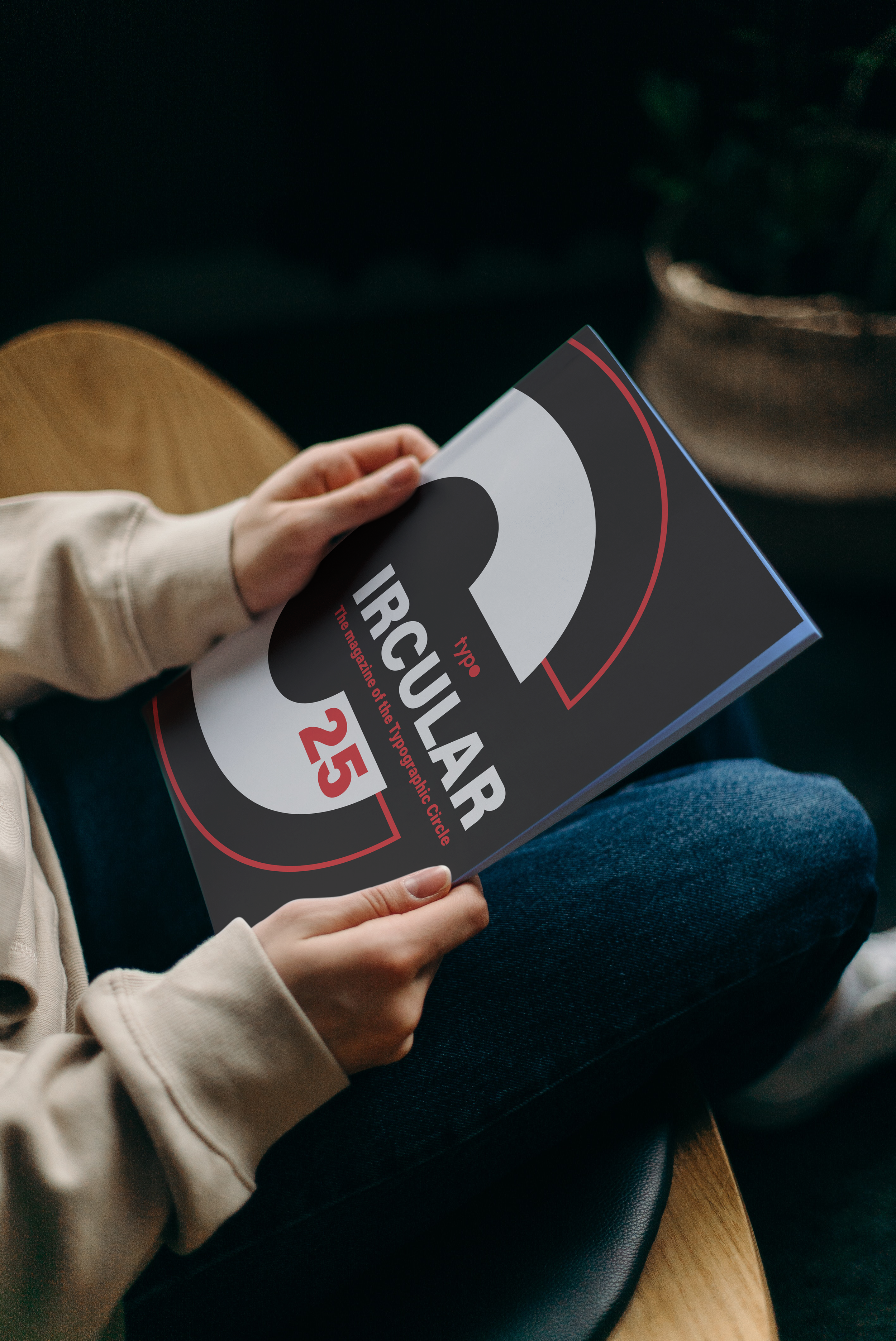
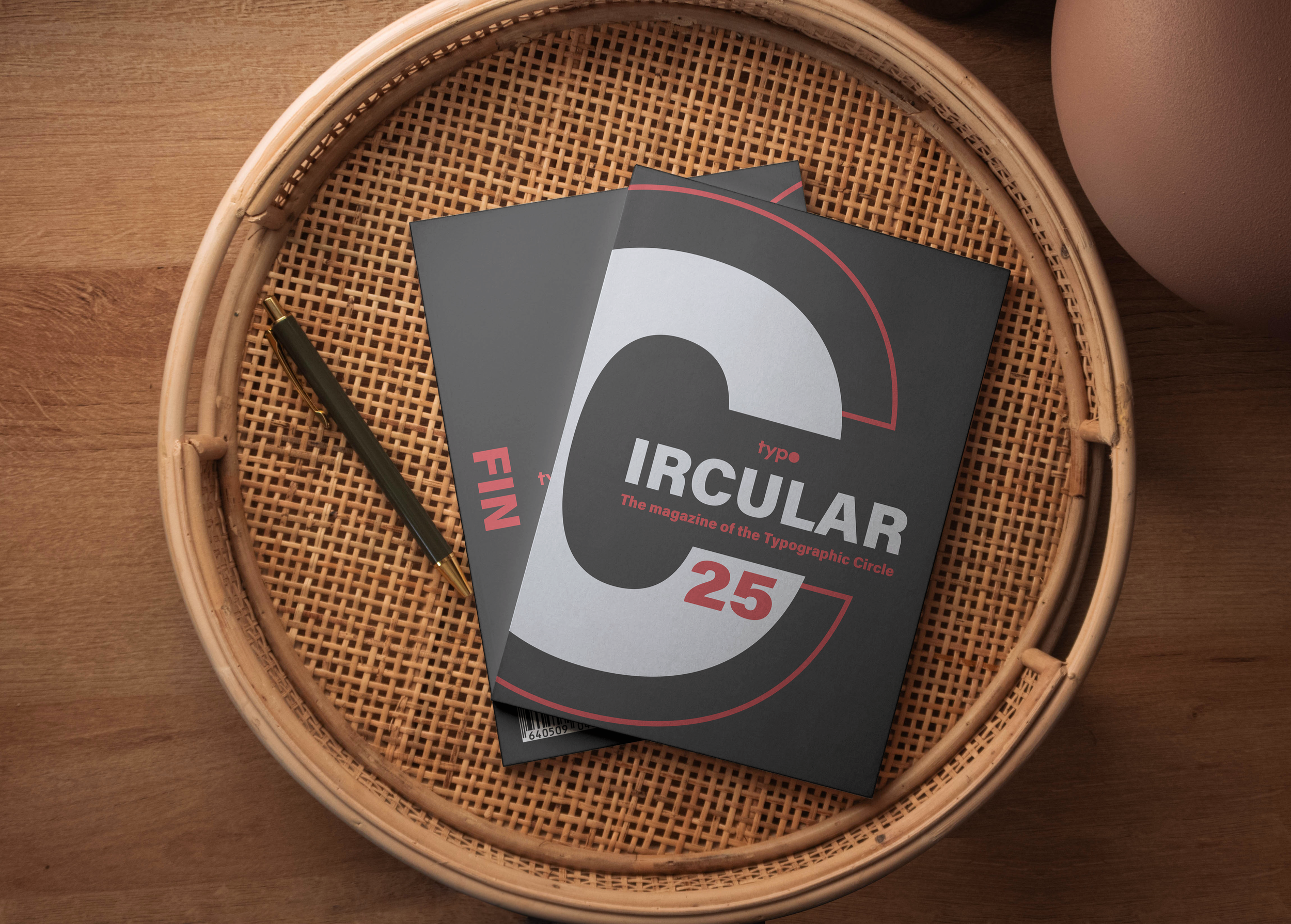
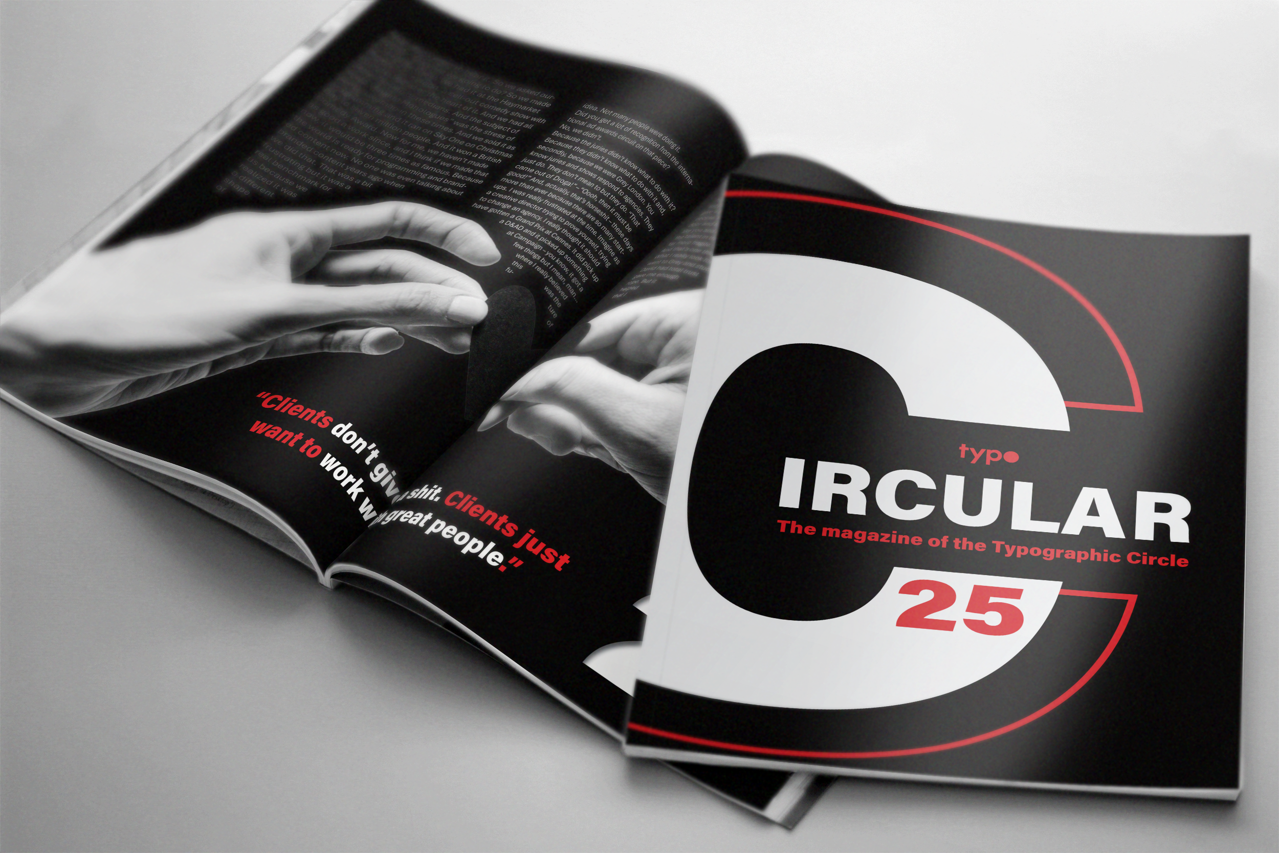
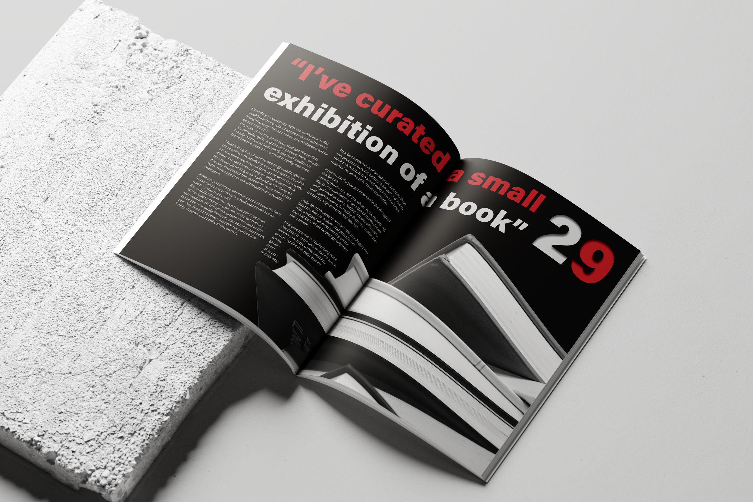
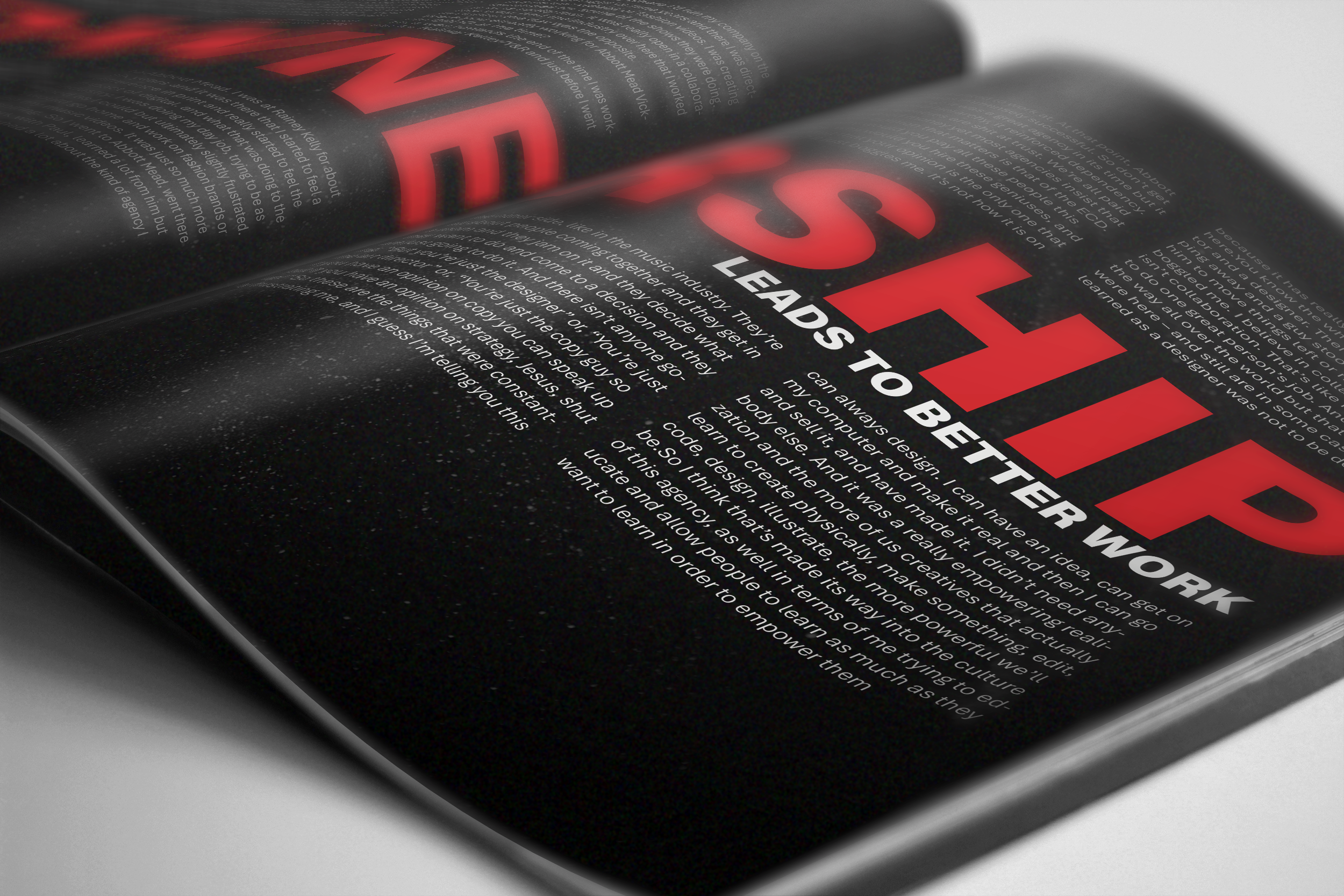
CIRCULAR 25 MAGAZINE
My objective was to develop an experimental and expressive 20 page publication that tells the story of my chosen designers through a unique typographic lens. By balancing bold, abstract layouts with a minimal aesthetic, I created a visual pace that remains consistent with the Circular identity whilst allowing for significant creative freedom in the use of black space and scale.
Magazine
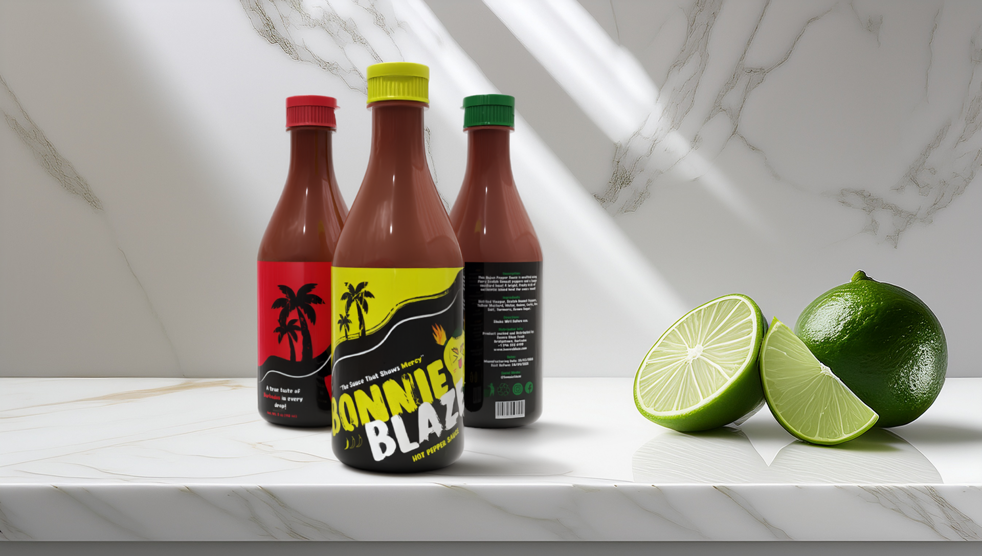
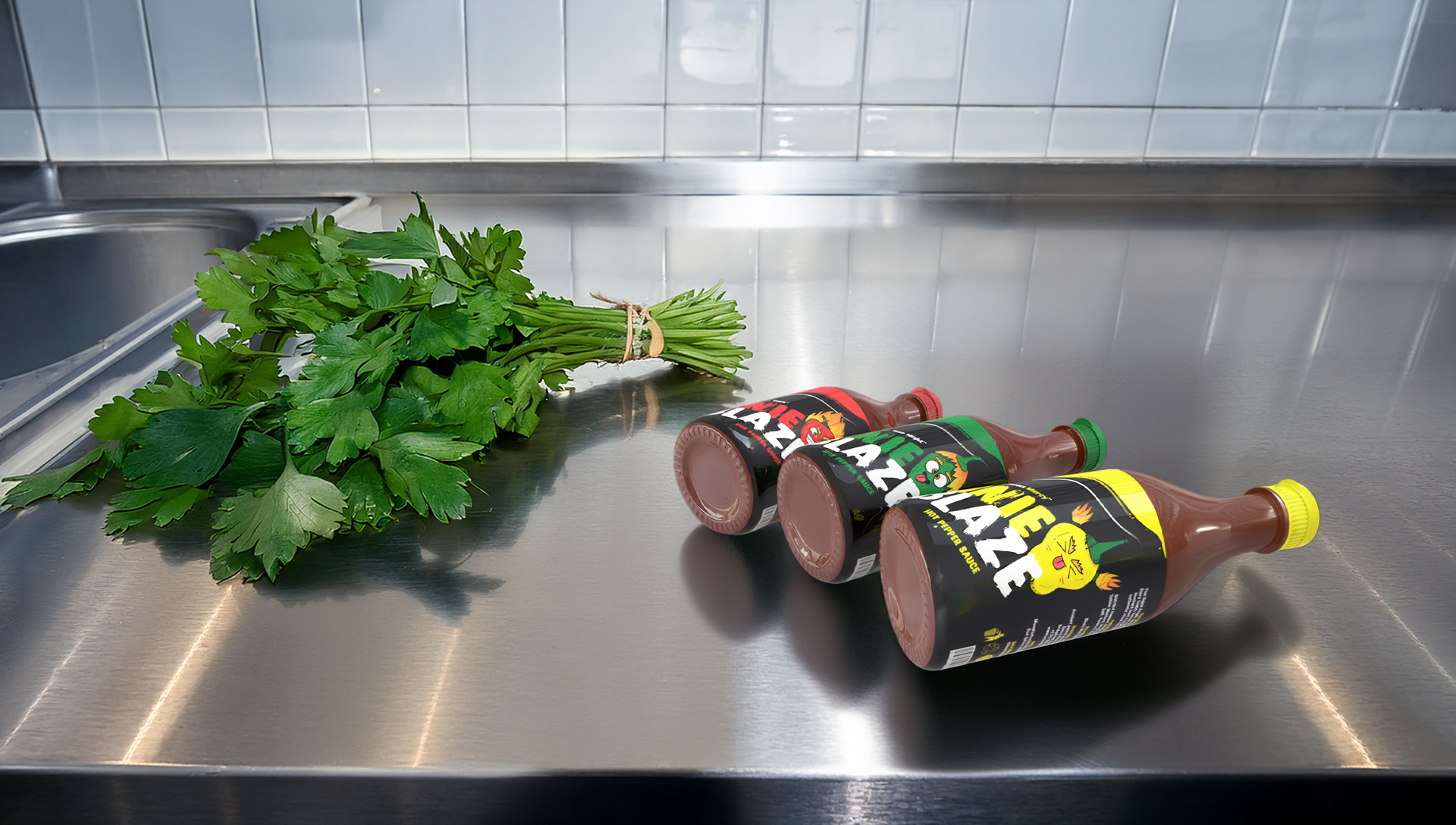
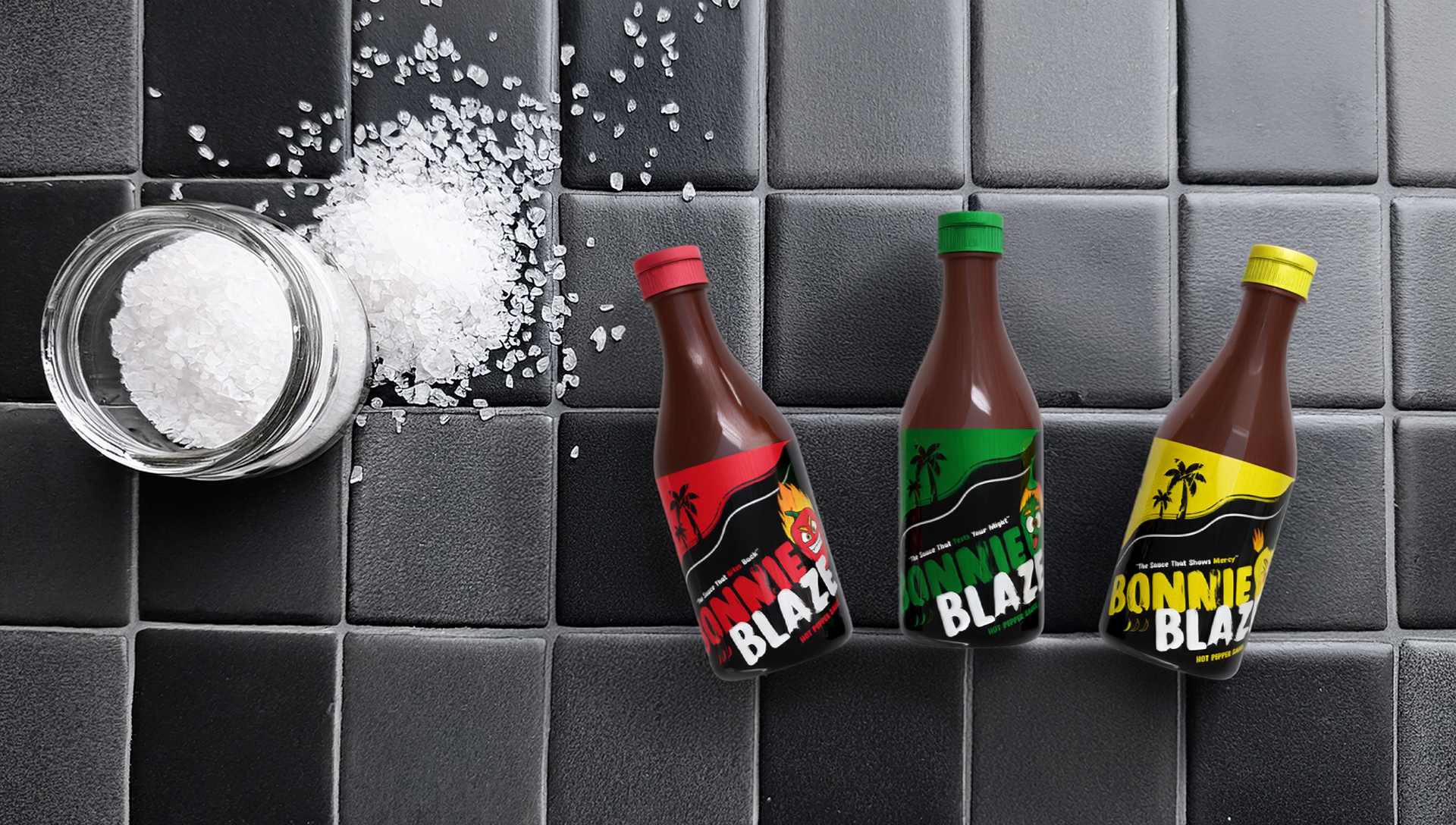
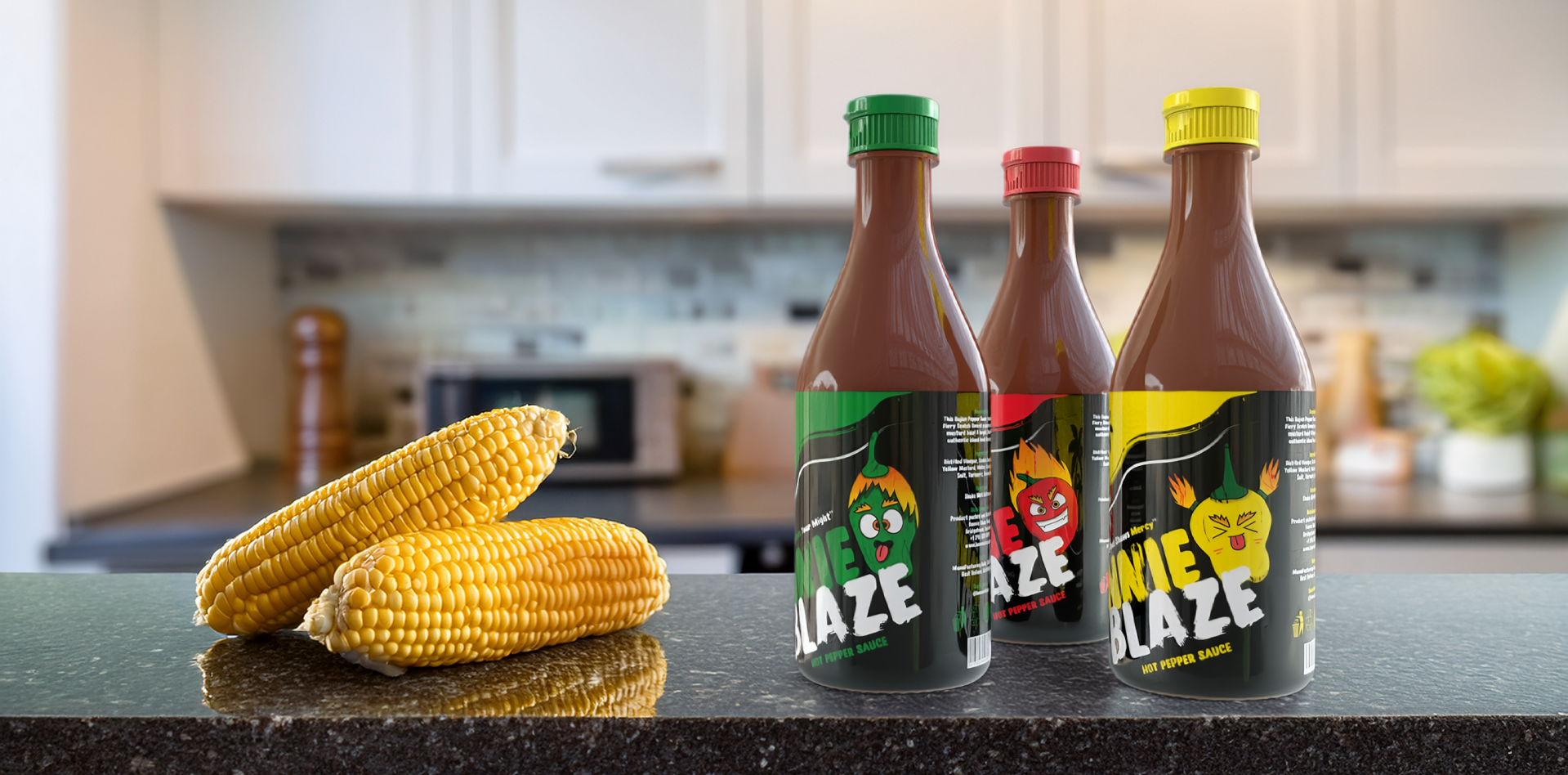
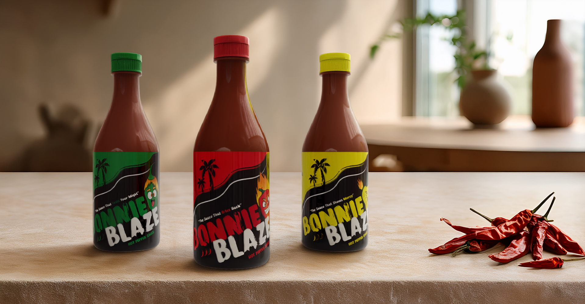
Bonnie blaze hot sauce
My objective was to develop a commercial packaging system that translates cultural heritage into a modern brand narrative. Through the creation of distinct brand mascots and a vibrant colour coded language, I produced a three piece product set that maintains a unified identity. This process involved mastering technical dielines and 3D mockup execution to ensure the brand story remains consistent across every physical touchpoint.
PACKAGING
Thank you for your time. I hope to have the pleasure of hearing from you soon!
“100% of the shots you don’t take, don’t go in.”